Why Visual Consistency Is Your Small Brand's Secret Weapon
Jun 17, 2026 · 5 min read
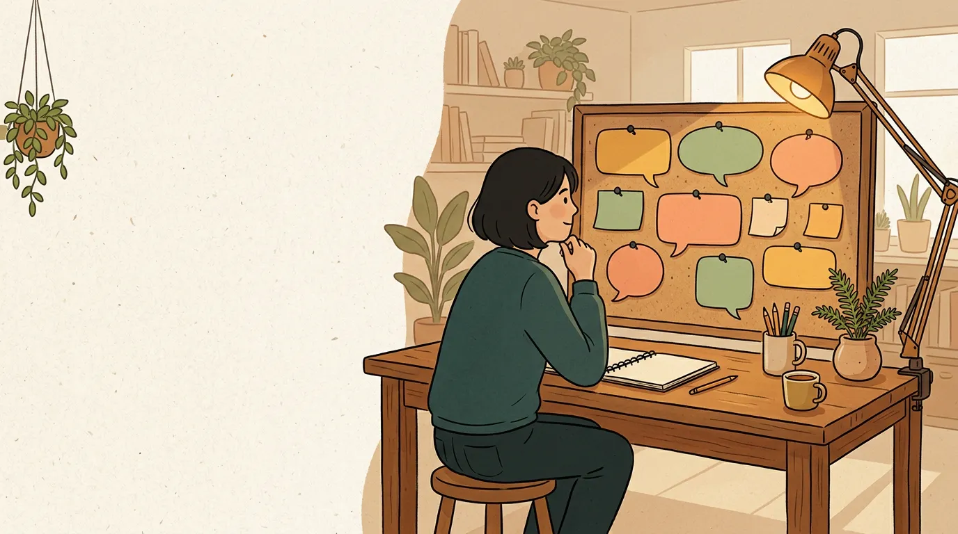
People recognize you before they read you
Before a potential customer reads a single word on your website or social post, their brain has already formed an impression. It happens in less than a second: colors, shapes, layout, and image style all register together as a feeling. If that feeling is "this looks familiar and trustworthy," you have their attention. If it's "I'm not sure what this is," they keep scrolling.
This is why visual consistency matters more than most small-business owners realize. It is not about having a gorgeous logo or a big design budget. It is about showing up in a way that feels like the same place every time. Over weeks and months, that repetition builds recognition. Recognition builds trust. Trust builds sales.
Big brands have known this for decades, which is why certain logos and color combinations feel like old friends even in a new city. The good news: you do not need their budget. You need a simple visual system and the discipline to use it.
The five pieces of a simple visual system
A complete visual identity sounds complicated, but it really comes down to five elements. Think of them as a short checklist rather than a design textbook:
- Logo (or logo-mark). A single, simple mark that represents your brand. A clean wordmark in one font, or a basic geometric shape, works perfectly well for most small businesses.
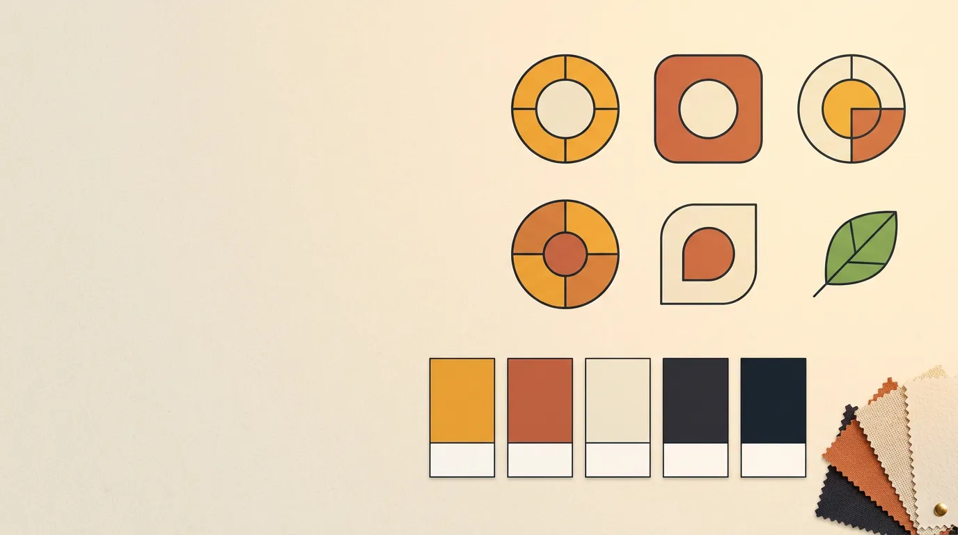
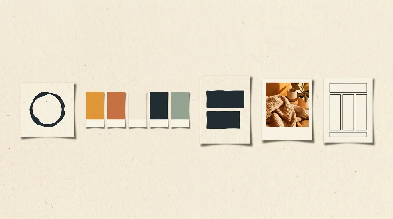
- Color palette. Two or three core colors that appear across everything you produce. This is the single most powerful lever you have for instant recognition.
- Typography. One or two fonts used consistently: one for headlines, one for body text. That is it.
- Imagery style. Are your photos bright and airy, or warm and earthy? Do you use illustrations, flat graphics, or real photography? Picking a lane and staying in it ties your content together.
- Layout patterns. The way you arrange elements on a page or post. Repeating the same basic structure makes your content recognizable before someone reads a single word.
You do not need all five to be perfect on day one. Getting your palette and logo-mark stable is a solid starting point. Add the rest as you go.
Pick a palette and actually use it
Color is the fastest path to recognition because the human brain processes it before shape, and shape before words. A consistent palette does more work per post than almost anything else.
Here is how to choose and commit to yours:
- Start with what already feels right. Look at your existing materials. Are there colors you already gravitate toward? Begin there.
- Limit yourself to two or three core colors. One dominant color (used most), one accent (for highlights and calls to action), and one neutral (a background tone or dark text color). Three is plenty.
- Test them together. Put your colors side by side. Do they feel like the same brand? Do they work on both a light and dark background? Adjust until yes.
- Write them down as specific values. A hex code (#E8A25B) removes all guesswork. Everyone on your team, and every tool you use, should work from the same numbers.
Once you have those values, use them everywhere: social posts, email headers, presentation slides, product photos, invoices. The more contexts where the same colors appear, the faster recognition builds.
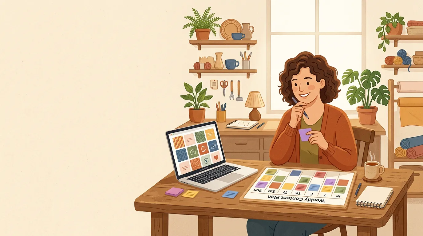
Templates: consistency without a design degree
The most practical tool for visual consistency is the template. A template is simply a layout you have already designed (or borrowed from a tool like Canva or Adobe Express) that you reuse each time you make a certain type of content.
One template for announcements. One for quotes or testimonials. One for a product highlight. One for a tip or list. Four layouts can carry an entire month of content while making everything look cohesive, and they save time because the structure is already right.
A few things to lock inside every template:
- Your logo in a consistent position (usually a corner)
- Your core colors applied to backgrounds and text
- Your chosen fonts at consistent sizes
- The same margins and padding so nothing ever looks cramped
If you are using a design tool, save these as master templates and make copies rather than editing the original. That single habit prevents a lot of accidental drift.
Audit your last nine posts
Pull up your most active social channel and look at the last nine posts together. Ask yourself:
- Could someone identify these as one brand without seeing the account name?
- Are the same colors showing up in most or all of the posts?
- Do the fonts and text styles feel consistent?
- Does the image style feel like one brand made all of these?
- Is your logo present and in roughly the same position?
If you answered yes to most of those, you are in good shape. If several posts feel like they came from different brands, pull back toward your core palette and templates before the next batch goes out.
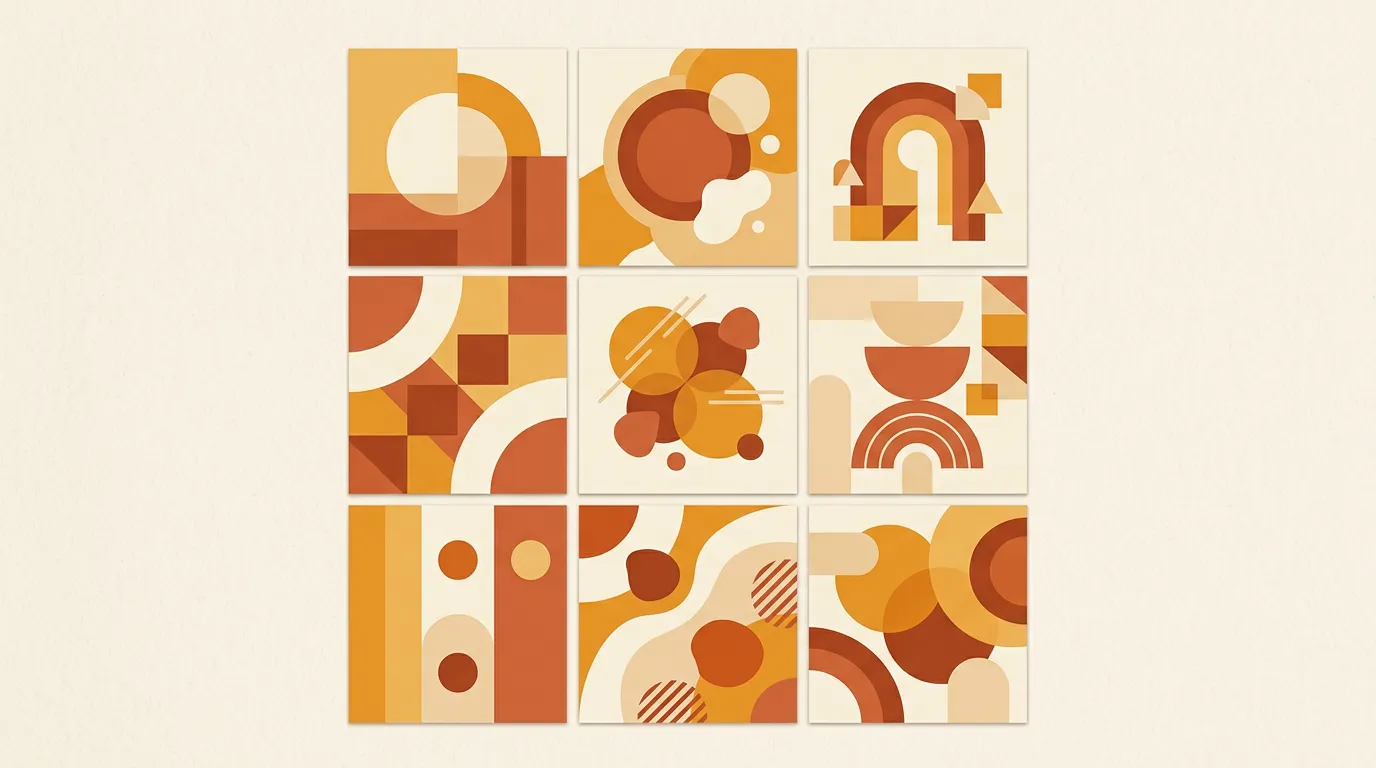
The nine-post view is useful because that is exactly what a new visitor sees when they land on your profile. It is your storefront window, and it should look intentional. Even one or two posts that break from your palette can make the whole grid feel scattered.
Visual consistency rewards patience. You will not see recognition build overnight, but six months from now, if you have held to your palette and templates, people will start calling your brand "professional" or "put-together" without being able to say why. That is the system doing its work quietly in the background.
If you want more practical ideas for building a brand people remember, there is plenty more on the Beevi blog.
Frequently asked questions
How many colors should a small brand use?
Two or three is the right range for most small businesses: one dominant color, one accent, and one neutral. More than three colors makes consistency harder to maintain and recognition slower to build.
Do I need a professional logo to look consistent?
Not necessarily. A clean, simple wordmark in one font is enough to start. What matters more than polish is using the same mark, in the same form, everywhere. Consistency with a simple logo beats inconsistency with an elaborate one.
How long does it take for visual consistency to build recognition?
Most small businesses start to see meaningful recognition after three to six months of consistent posting. The key is showing up regularly with the same palette and style rather than switching directions every few weeks.