
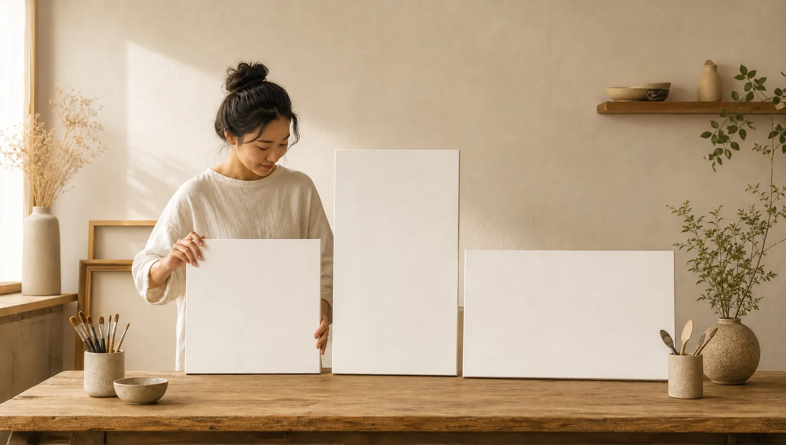
What social media image size should a small business use?
If you need one default feed size, use 1080 x 1350 pixels. It gives you a 4:5 portrait canvas that works well for Instagram, Facebook, and LinkedIn, while using more vertical screen space than a square post. For full-screen Stories, Reels, Shorts, and TikTok content, use 1080 x 1920 pixels. For link previews and landscape assets, start with 1200 x 630 pixels.
Those three sizes cover most of a small business's weekly publishing needs. You may still need a square crop, a channel banner, or a YouTube thumbnail, but you do not need to design every post from a blank page. The real goal is not memorizing dozens of dimensions. It is choosing the right canvas early, protecting the important parts of the design, and exporting controlled variations.
This cheat sheet focuses on the formats small businesses use most often. It reflects current guidance in the Hootsuite 2026 social media image size guide, the Buffer 2026 image size guide, and Meta's feed image specifications. Platform specifications and in-app crops can change, so always preview a high-value campaign in the actual publishing flow before it goes live.
The 2026 social media image size cheat sheet
Use the dimensions below as reliable working sizes, then check the final crop on the destination platform. A recommended upload size is not a promise that every device, profile grid, or placement will display the entire canvas.
| Platform | Feed and post images | Full-screen format | Profile, cover, or banner |
|---|---|---|---|
| Portrait: 1080 x 1350; square: 1080 x 1080; landscape: 1080 x 566 | Stories and Reels: 1080 x 1920 | Keep profile subjects centered because the profile image is displayed as a circle | |
| Vertical feed: 1080 x 1350; landscape or link: 1200 x 630 | Stories and Reels: 1080 x 1920 | Cover: 851 x 315 | |
| Square: 1200 x 1200; portrait: 1080 x 1350; link: 1200 x 627 | Create a dedicated vertical version when the placement calls for it | Personal banner: 1584 x 396; Company Page cover: 1128 x 191 | |
| X | Landscape: 1600 x 900; square: 1080 x 1080 | Use a dedicated vertical asset when publishing vertical media | Profile: 400 x 400; header: 1500 x 500 |
| TikTok | Video or photo post: 1080 x 1920 | Video or photo: 1080 x 1920 | Keep the focal subject away from interface controls |
| YouTube | Thumbnail: 1280 x 720 | Shorts: 1080 x 1920 | Banner: 2560 x 1440 |
Pixel dimensions describe resolution. Aspect ratio describes shape. A 1080 x 1350 canvas is 4:5, 1080 x 1920 is 9:16, and 1200 x 630 is close to 1.91:1. If a design tool asks for a ratio rather than pixels, match the ratio first and export at the recommended resolution. Never stretch a finished image into a new ratio. Reposition and crop it instead.
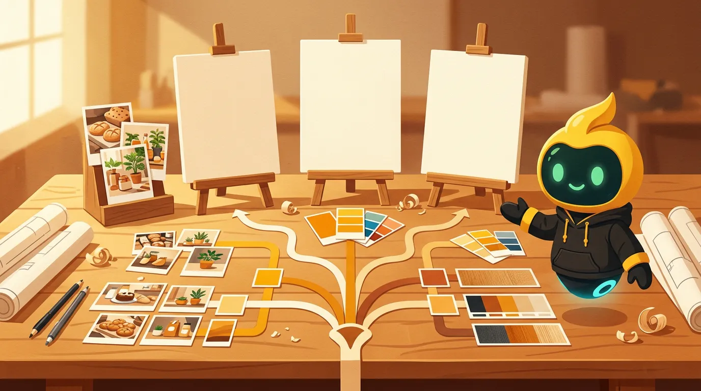
Build every campaign from three master files
A three-master-file system is the fastest practical way to cover feeds, full-screen placements, and link previews without creating a messy template library. Build these canvases once, duplicate them for each campaign, and treat platform-specific sizes as exports or light recompositions.
Master 1: 1080 x 1350 for feed posts
Use this 4:5 portrait file for your main Instagram, Facebook, and LinkedIn creative. Place the product, person, or core visual near the center, with enough breathing room to make a square crop later. When X needs a square version, duplicate the design, switch the canvas to 1080 x 1080, and adjust the composition rather than cutting off the top and bottom automatically.
Master 2: 1080 x 1920 for vertical content
Use this 9:16 file for Instagram Stories and Reels, Facebook Stories and Reels, TikTok posts, and YouTube Shorts. This should be a real vertical composition, not a feed graphic floating in the middle of a tall background. Enlarge the subject, simplify supporting elements, and reserve open space where app controls may appear.
Master 3: 1200 x 630 for links and landscape posts
Use this horizontal file for Facebook link previews and as the starting point for LinkedIn links. LinkedIn's 1200 x 627 recommendation is close enough that a small crop or canvas adjustment is straightforward. For Instagram landscape, export a deliberately resized 1080 x 566 copy. For X, create a 1600 x 900 variation and check the new 16:9 framing.
Name files by campaign and format, such as spring-menu-feed, spring-menu-vertical, and spring-menu-link. This is more useful than naming files by platform because one master can serve several channels. Keep an editable source file and save exported copies separately so a last-minute crop does not damage the master.
If you plan content in batches, connect these three assets to each item in your small-business social media calendar. That makes missing formats visible before publishing day.
How do you prevent social media images from being cropped?
Keep essential content inside a centered safe zone and treat every edge as expendable. A platform can crop an image differently in the feed, profile grid, preview card, or mobile interface, even when the uploaded file uses the recommended dimensions.
For every master, place faces, products, offer details, and other must-see elements in the central area. Background texture, decorative shapes, and secondary props can extend toward the edges. On a 1080 x 1920 vertical canvas, leave generous space at the top and bottom for account details, captions, buttons, and playback controls. Also keep important elements away from the far right edge, where interaction controls often sit.
Apply these checks before export:
- Add temporary safe-zone guides to the design file, then hide them before export.
- Test the feed master with a centered square crop. The main subject should still make sense.
- Test circular profile images with a circle mask, not a square preview.
- View banners on both wide and narrow screens when possible. Their visible area can shift.
- Avoid placing small type directly against any edge. Compression and cropping make it harder to read.
For important launches, upload a private test or use the platform's preview screen. Check both the feed appearance and any secondary view that matters, such as an Instagram profile grid or a YouTube channel page. A five-second crop check is cheaper than rebuilding a campaign after publication.
Which platform details cause the most rework?
Banners, profile crops, link previews, and multi-placement vertical posts cause the most surprises. They deserve separate templates or a deliberate preview step.
Instagram accepts portrait, square, and landscape feed images, but the profile grid may present them differently from the feed. Design the 1080 x 1350 original so its focal point survives a tighter grid crop. For Reels, remember that a full-screen video and its grid preview do not expose the same area.
Facebook cover images can display differently across desktop and mobile. Use the 851 x 315 canvas as the working size, but keep identifying details away from the outer edges and from areas that may be obscured by the profile image. A feed post and a link post are also different jobs: use 1080 x 1350 for a native vertical post and 1200 x 630 for the image associated with a web link.
LinkedIn has two easy-to-confuse banner sizes. Personal profiles use 1584 x 396, while Company Pages use 1128 x 191. Keep separate locked templates for each. In the feed, 1080 x 1350 is a strong portrait choice, while a linked page should provide a 1200 x 627 preview image.
X profile photos display as circles, and headers can crop according to device and viewport. Keep the subject centered in the 400 x 400 profile file and avoid important details at the extreme top or bottom of the 1500 x 500 header. Use 1600 x 900 for a landscape post when you want a clean 16:9 presentation.
TikTok and YouTube Shorts both use 1080 x 1920, but that does not make every vertical design interchangeable. Interface controls, captions, and the opening frame can change what viewers see. YouTube thumbnails are a separate 1280 x 720 asset, while the 2560 x 1440 channel banner needs a centered core composition that remains useful across devices.
How should you export social media graphics?
Export photos as high-quality JPG files and graphics with sharp type or transparency as PNG files, unless the platform or publishing tool specifies otherwise. Keep the editable master in your design tool so you can respond to a specification change without recreating the post.
Use the sRGB color space for predictable screen color. Avoid repeated download-and-reupload cycles because each compression pass can soften details. If a platform rejects a file, check its file type and size before shrinking the pixel dimensions. When resizing, preserve the aspect ratio and inspect fine text, product labels, and faces at normal phone size.
A consistent visual system also reduces resizing errors. Reuse the same type hierarchy, color palette, spacing rules, and image treatment across all three masters. Consistency should come from the design system, not from forcing one identical crop everywhere. For a deeper look at that principle, read why visual consistency is your small brand's secret weapon.
The pre-publish image checklist
Before you publish, confirm the canvas, crop, clarity, and destination. This short checklist catches the mistakes that dimensions alone cannot prevent.
- Is this the correct format for the placement, not just the platform?
- Does the focal subject remain clear in the expected crop?
- Are faces, products, and essential details inside the safe zone?
- Is small text readable on a phone without zooming?
- Did you export from the master rather than enlarge a compressed download?
- Does the filename identify the campaign and format?
- Have you checked the actual platform preview for a paid or high-value campaign?
Review your master templates quarterly and before a major launch. Platform specifications, preview behavior, and interface overlays change. Current reference guides from Hootsuite and Buffer are useful starting points, but your final upload preview is the closest view of what customers will see.
Turn the cheat sheet into a repeatable workflow
The best image-size workflow is three masters, one safe-zone check, and a platform preview for anything important. Start with 1080 x 1350 for feeds, 1080 x 1920 for full-screen content, and 1200 x 630 for links. Create exact banner, thumbnail, square, or landscape variations only when the placement requires them.
Save those templates beside your content calendar, assign each campaign a feed, vertical, and link asset, and keep the visual system consistent across all three. You will spend less time searching for dimensions and more time improving the idea people actually see.
When you are ready to make consistent social content a repeatable part of your week, you can explore Beevi's plans.